When we shared that we were pregnant, one of the first questions to quickly follow words of congratulations was, “Are you finding out if you’re having a girl or boy?” And each time we responded, “No, we’re keeping it a surprise,” we’d either be met with glee or a disbelieving gasp from those who like being organized in advance!
Hands down, finding out Elle was a girl was the most amazing moment of our lives. So it was a no-brainer on our end that we’d keep our second (who turned out to be Emmett – a boy!) a surprise as well.
But let’s be real guys – as much as I love a good surprise, I also love feeling organized. And so, before Emmett was born, I got cracking on designing the perfect white and grey gender-neutral nursery in partnership with The Brick.
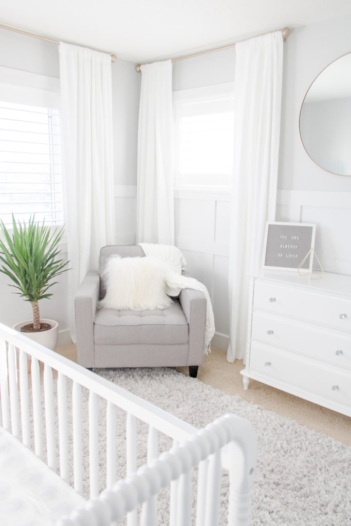
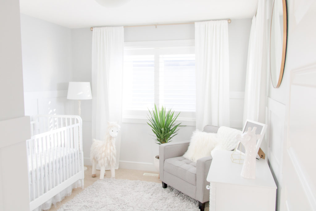
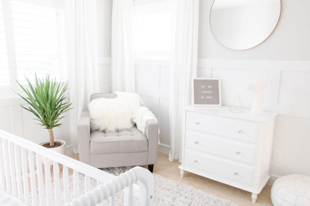
Designing Our White and Grey Gender-Neutral Nursery
Midway through my pregnancy, Aaron and I were shopping for a new mattress at The Brick when I first noticed they had a nursery line. Or – more accurately – I was walking through the store and stopped in my tracks when a stunning gold crib caught my eye.
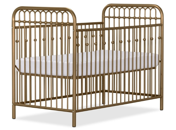
Fast forward a few months and I was ready to design a room for Baby Hunka #2. I’m a fan of light, airy spaces and decided that a white and grey colour scheme would be a fitting backdrop for a gender-neutral nursery. I set Aaron to work installing white board and batten wainscoting to add some interest to the previously plain walls and started my hunt for furniture.
Believe it or not, the ‘hunt’ was not difficult – I was able to design the nursery of my DREAMS without even stepping foot in a store!
White and Grey Gender-Neutral Nursery Design Board
I headed to TheBrick.com to revisit the Gold Monarch Hill Metal Crib that had captured my attention in-store, when I saw THE perfect crib.
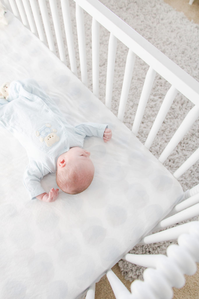
I immediately fell in love with the White Rowan Valley Crib. Its simple, elegant design and bright, white tone were exactly what I envisioned for our nursery. Plus, I loved its detailed, coiled spindles.
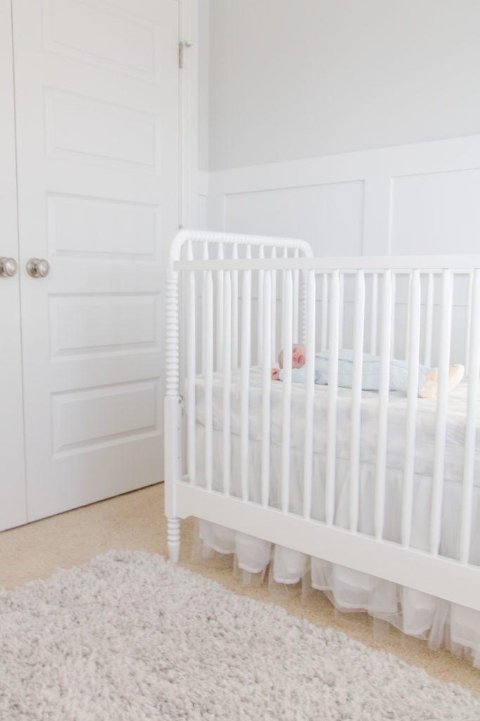
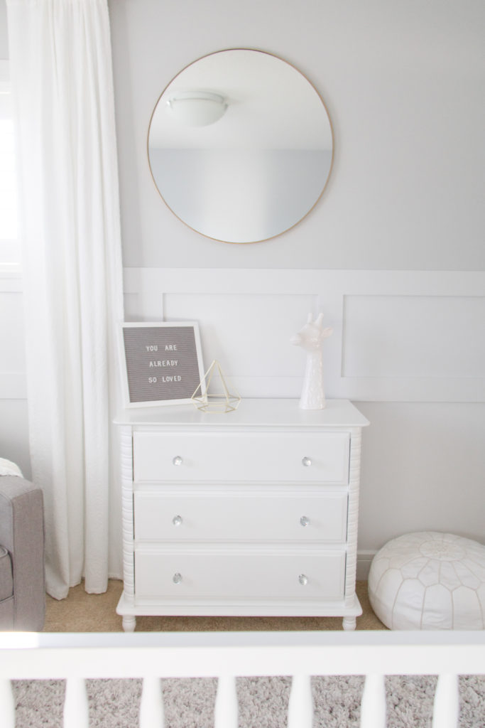
I was especially thrilled when I saw it had a matching dresser with an optional changing station topper.
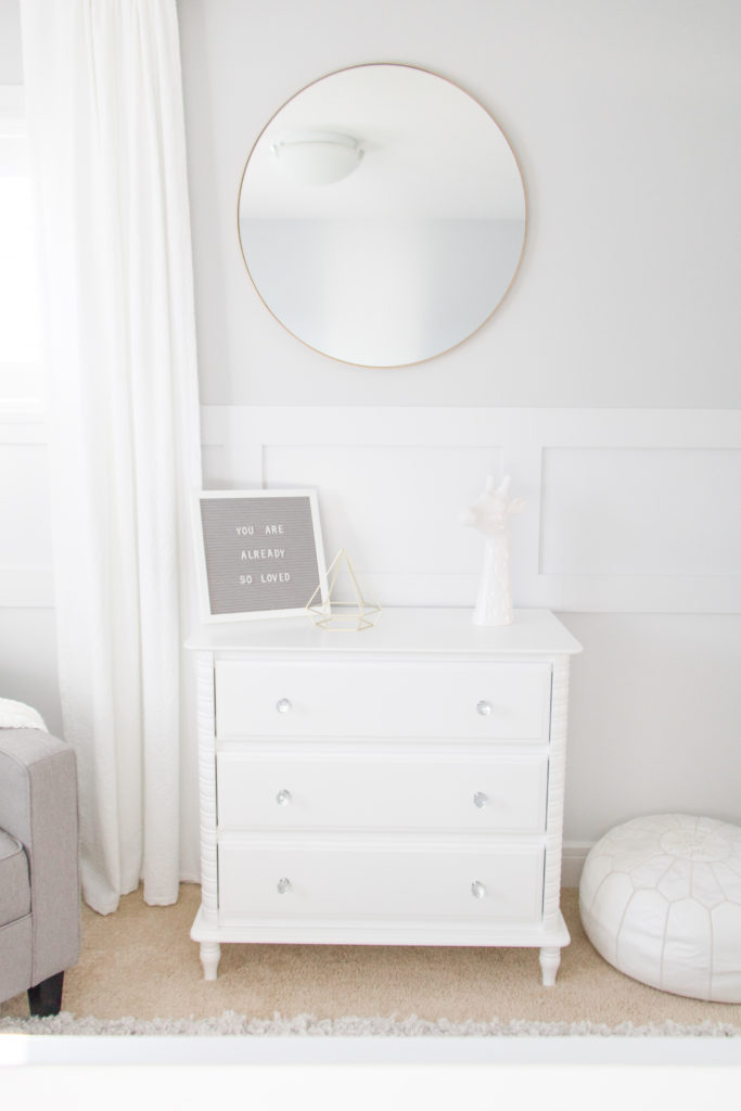
Once I found these two focal pieces, it was SO easy to put together a nursery design board with other furnishings from The Brick:
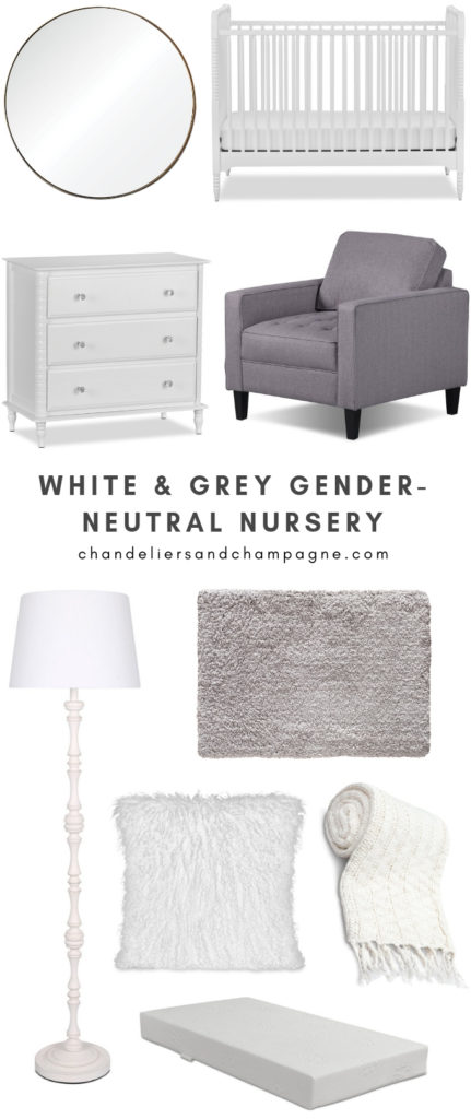
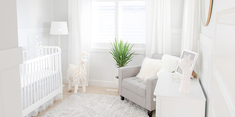
/ Oryx Mirror / White Rowan Valley Crib / White Rowan Valley Dresser / Paris Linen-Look Fabric Chair in Stone / Megan Antique White Standing Lamp / Alpaca Light Grey Area Rug / White Mongolian Sheepskin Accent Pillow / White Knit Throw with Tassels / Safety 1st Peaceful Lullabies Crib Mattress /
Our Furniture
Now all the pieces are here, I could not be more thrilled with how everything came together!
The crib and dresser are even more stunning in person than I could’ve imagined. I paired the crib with a Safety 1st Peaceful Lullabies Crib and Toddler Bed Mattress, which is praised for being lightweight and durable.
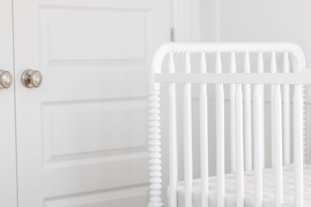
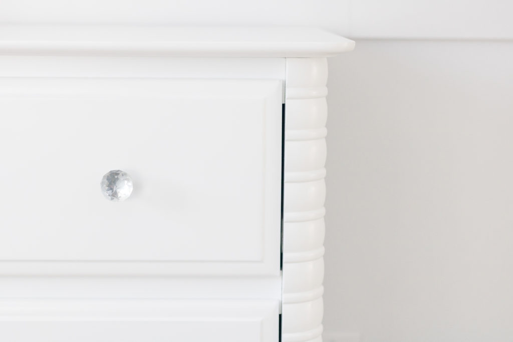
Plus, I love that the dresser comes with both crystal and silver knobs, making it easily customizable to a boy or girl.
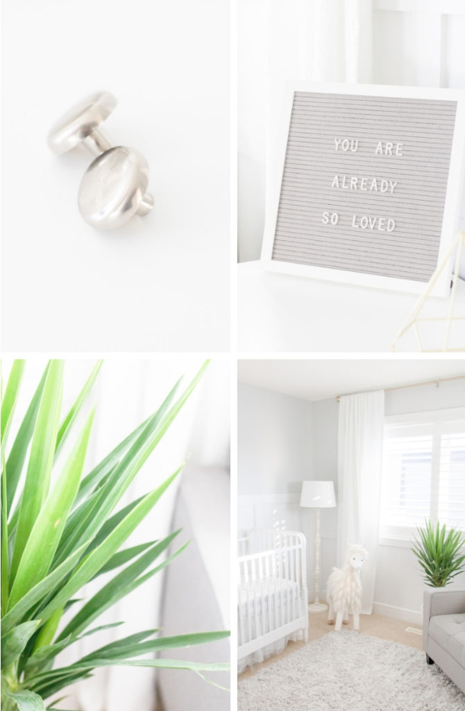
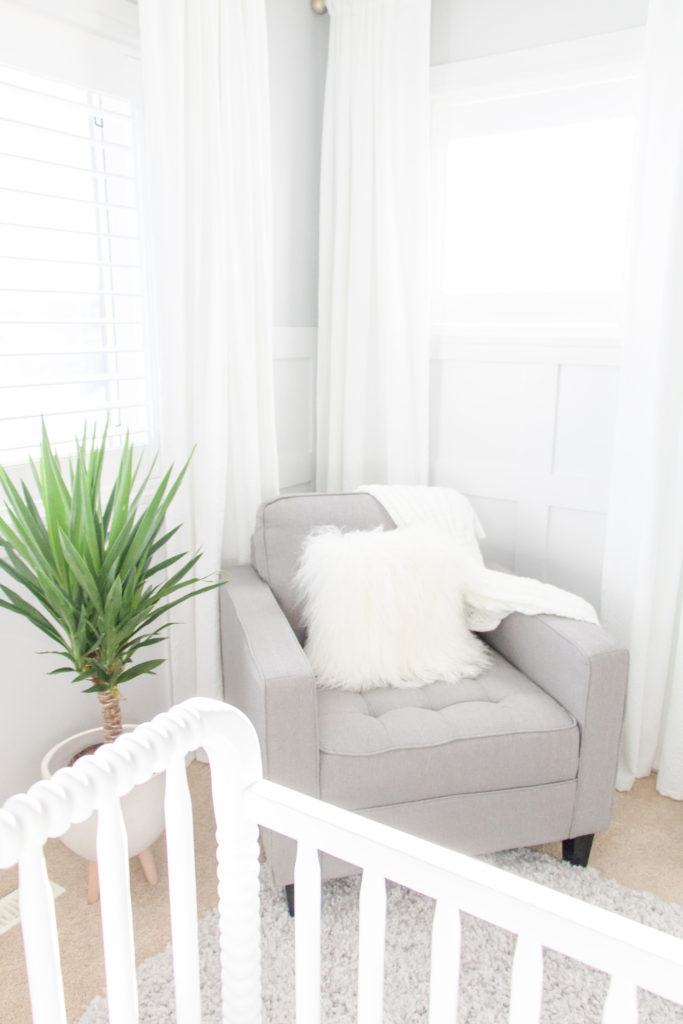
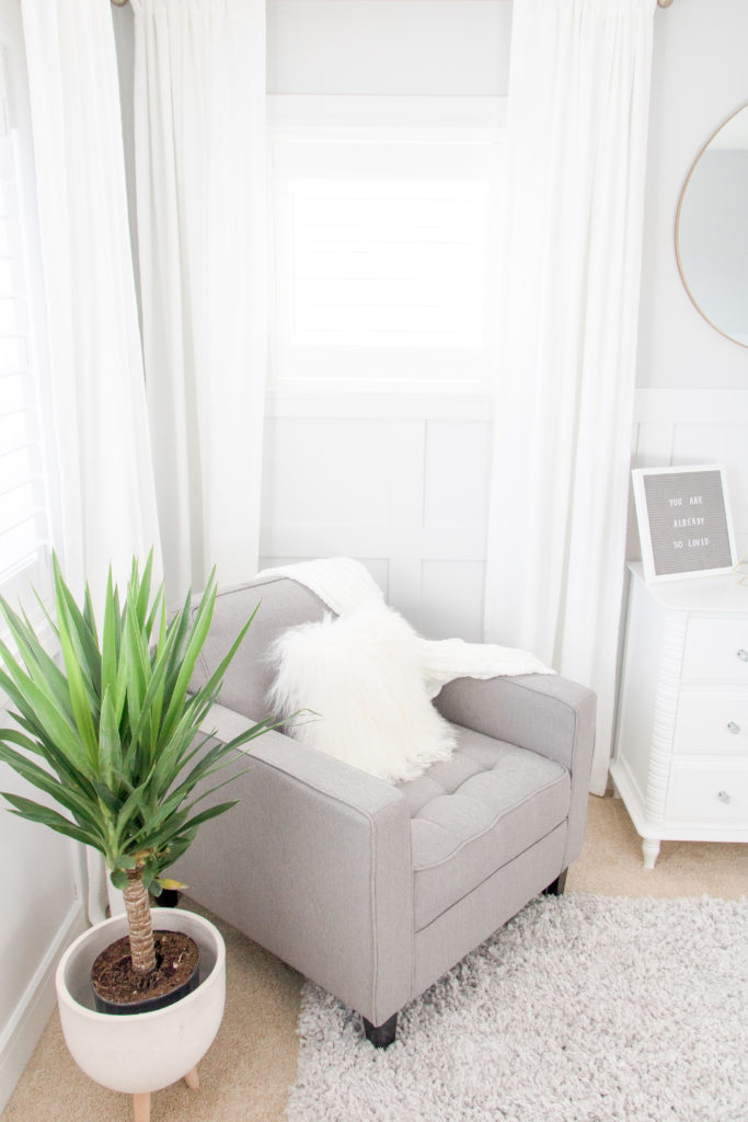
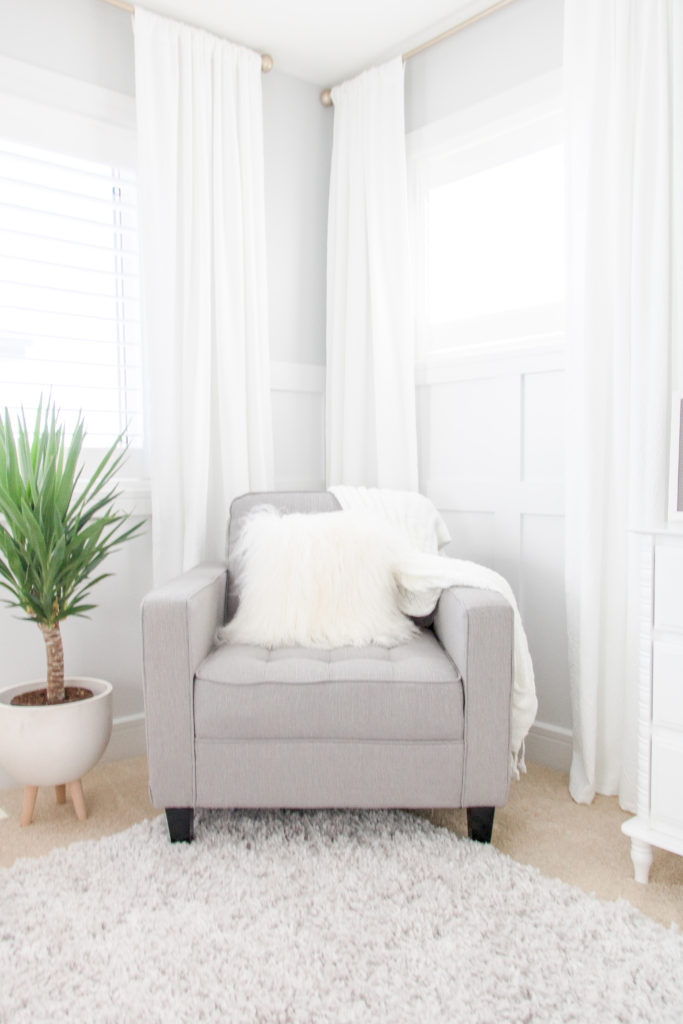
I selected the Paris Linen-Look Fabric Chair in Stone as a cozy spot to cuddle up with baby during late-night feeds, and to enjoy books and snuggles as Emmett grows older. I’m happy to report that it’s SO comfy on top of being good-looking (thank you, high-density foam). Plus, it comes in six additional colors – spa teal, granite, tangerine, cherry, chocolate and ocean – to easily match your style.
Our Accessories
I’m also really pleased with the decorative accents I selected – especially the circular, gold-tone Oryx Mirror. Isn’t it SUCH a statement piece?
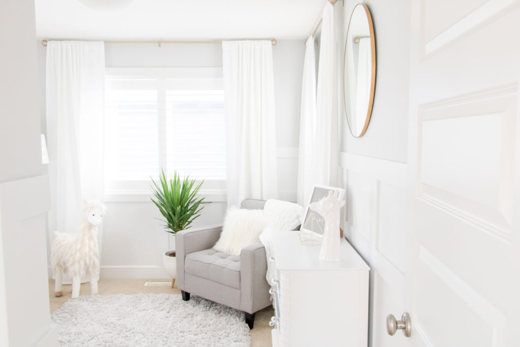
All my friends and family who visit immediately comment on our Alpaca Light Grey Area Rug. I chose this rug because it was the perfect colour and size. But when it arrived, I was blown away by its plushness. Talk about cozy!

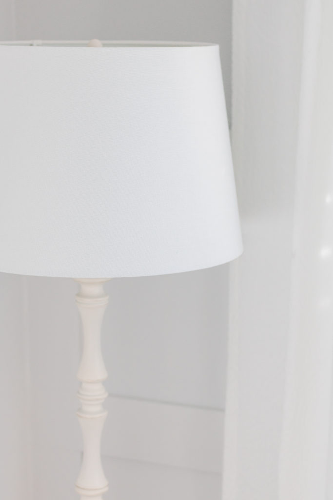
I selected the Megan Antique White Standing Lamp to add some height and light to the corner of the room.
And for extra texture, I dressed up our arm chair with a cozy tasseled blanket and Mongolian sheepskin pillow.

Paint Colour
I adore the paint color we chose for above the wall panelling. It’s Lace Falls by General Paint (which, by the looks of it, was since bought out by Sherwin-Williams). I’ve found a few websites suggesting comparable tones in other brands and it appears Behr’s Shiny Luster is a close match (and available in a multitude of finishes).
Next Steps
Now that Emmett’s arrived, I’m excited to add a few masculine touches to the room (have you spotted the llama – he’s one of them, lol). Plus, I have plans for a bit more gold to tie into my Oryx mirror and drape rods.
I’ll be sure to share my masculine updates soon but for now am going to bask in this relaxing space while enjoying all the newborn snuggles! (And pssttt – his watercolour jungle nursery is now complete and you can check out the reveal here).
A big thank you to The Brick for sponsoring this post and helping me create my dream nursery. As always, all opinions are my own and I’m happy to answer any questions you have in the comments below.
Xo Holly Hunka
Did you enjoy this white and grey gender-neutral nursery post? Give it a Pin!


So classic! I would love to know where the curtain panels are from!
Thank you Trista! These curtain panels where a great find at HomeSense Canada!
Love these neutral colors. Do you know what color grey paint is on the walls?
It’s a colour called Lace Falls!
What accent design did you use for the walls. Do you have a blog up about how you did it ?
[…] After Emmett was born and we found out he was a boy, I decided it was time to add a little extra charm to his white and grey gender-neutral nursery. […]
I LOVE this nursery!!! I’m trying to find the paint ‘lace falls’ but am not having any luck. do you know what company it was?!
Yes – it was Sherwin Williams! My sister just bought it this week – it was an old general paints color and they were able to locate it for her!
[…] Source […]